IELTS global marketing team is well known for their love of print materials, and approach that I affectionally call the 'Jaguar Method'. Relying extensively on detailed and luxurious brochures that are given expert editorial attention and high end press treatments to the marketing materials they produce, I was included in the domestic English and Arabic production pipelines.
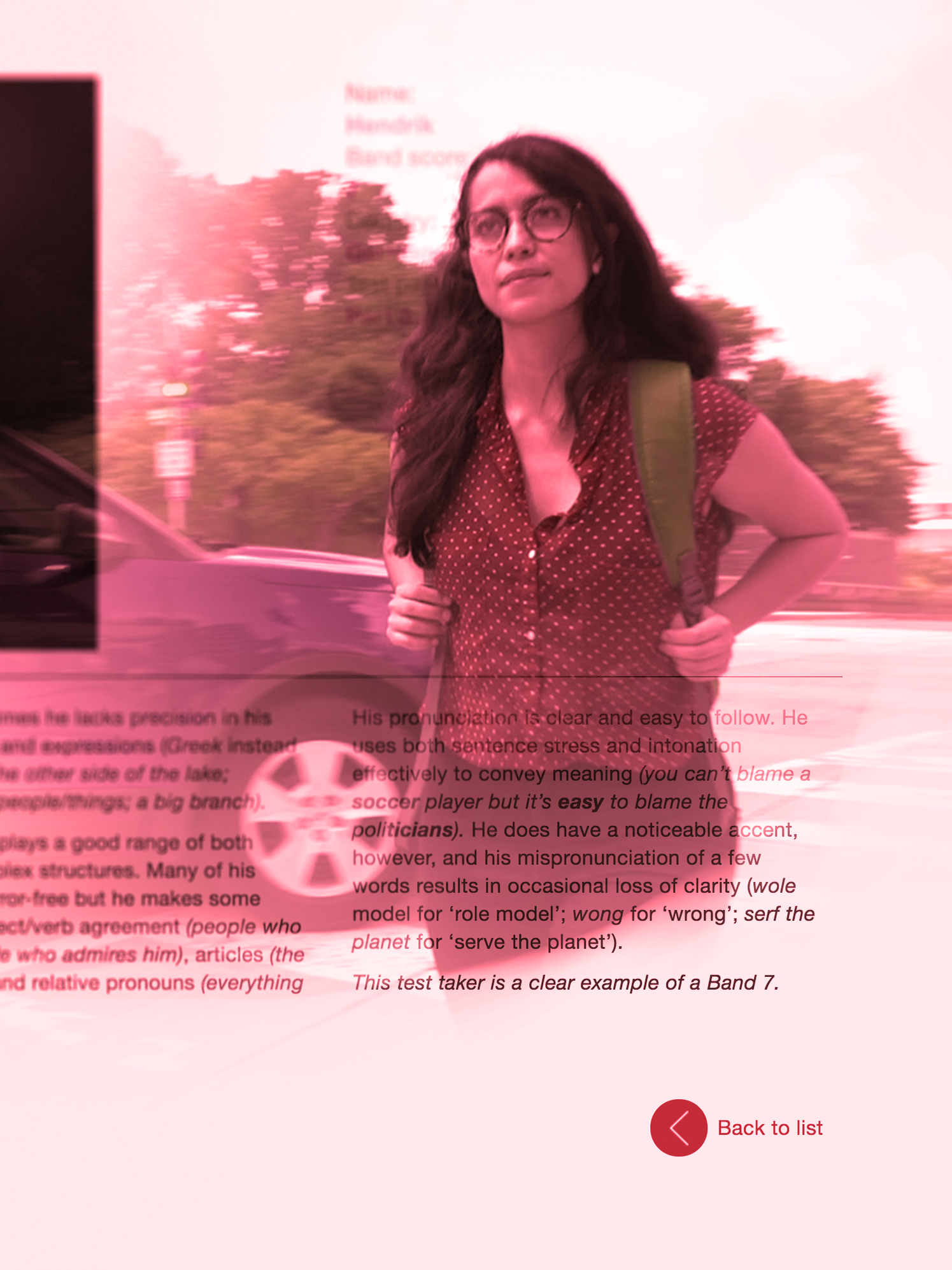
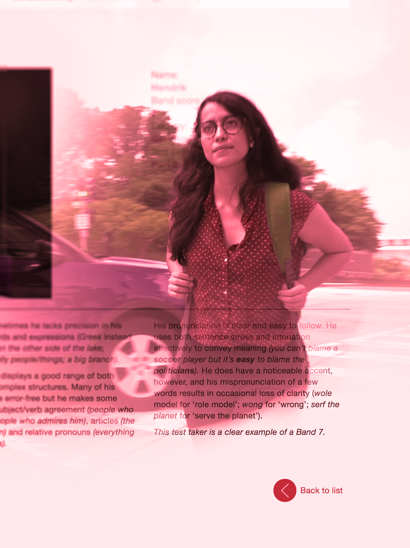
Digitizing the IELTS Scores Guide
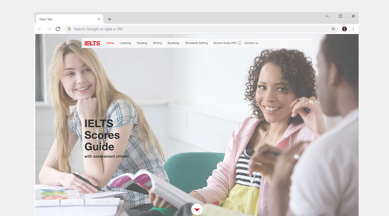
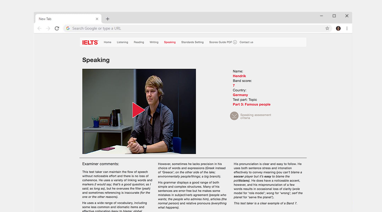
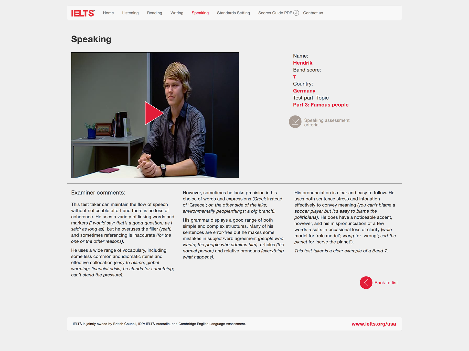
The IELTS Scores Guide is the perfect example of the 'Jaguar Method', a series of complex print solutions that became burdensome to the domestic team. Shipping costs and reproduction costs were eating into the marketing budget. The solution? An all digital IELTS Scores Guide made for the twenty-first century.
The original print shipped a 120 page volume perfect bound in legal sized with additional Adobe Flash app via included DVD.

As computers started to become smaller, the inclusion of optical media started to become more and more scarce in 2008 with the advent of the MacBook Air. Education took note, the DVDs ended up in the garbage or lost with the guide on a bookshelf.
Solving the Problem
The team wanted to update the Flash App for the scores guide, but the agency that held the authoring projects for the application refused to provide them in a give and take that delayed the completion of the project for five years.
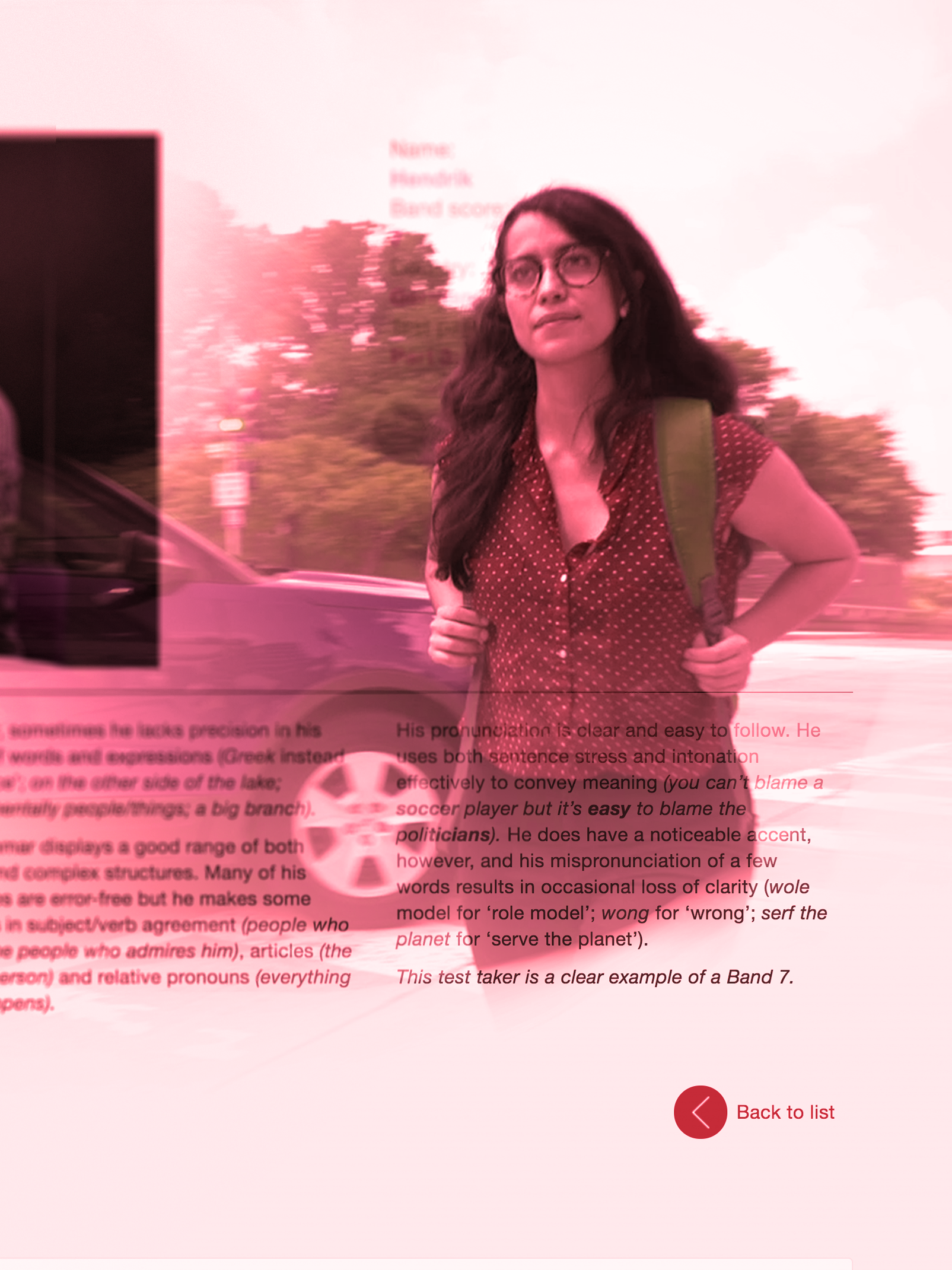
One of the first initiatives I undertook at IELTS was to complete the project. I worked with a developer to create a microsite for the IELTS Scores Guide, transcoding all the media files, including audio and video interviews, to modern mobile-responsive HTML5 standards, we created a Bootstrap web app that could live on the web as the digital scores guide, making it accessible and robust. With our revisions, rewrites, and review process the project was completed in a record nine months.
The IELTS Workshop Keynote
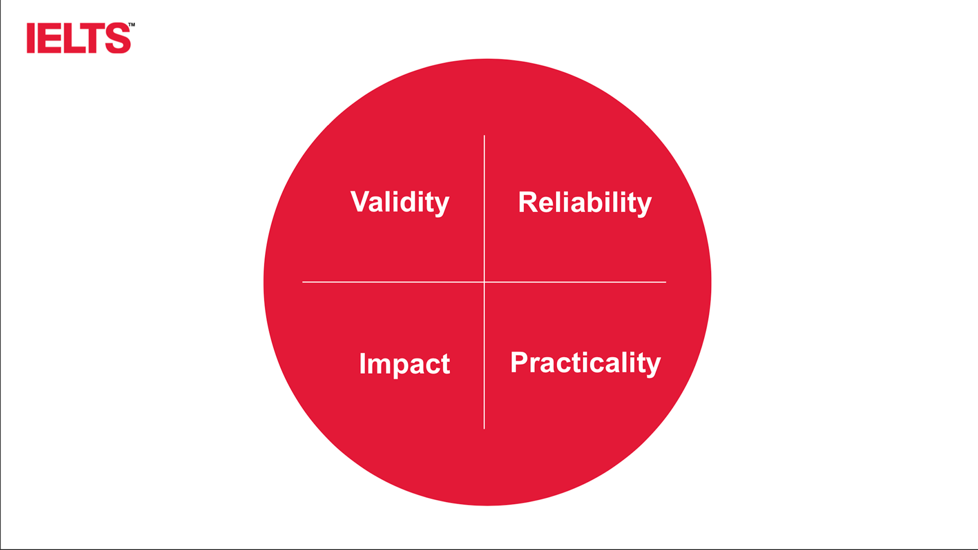
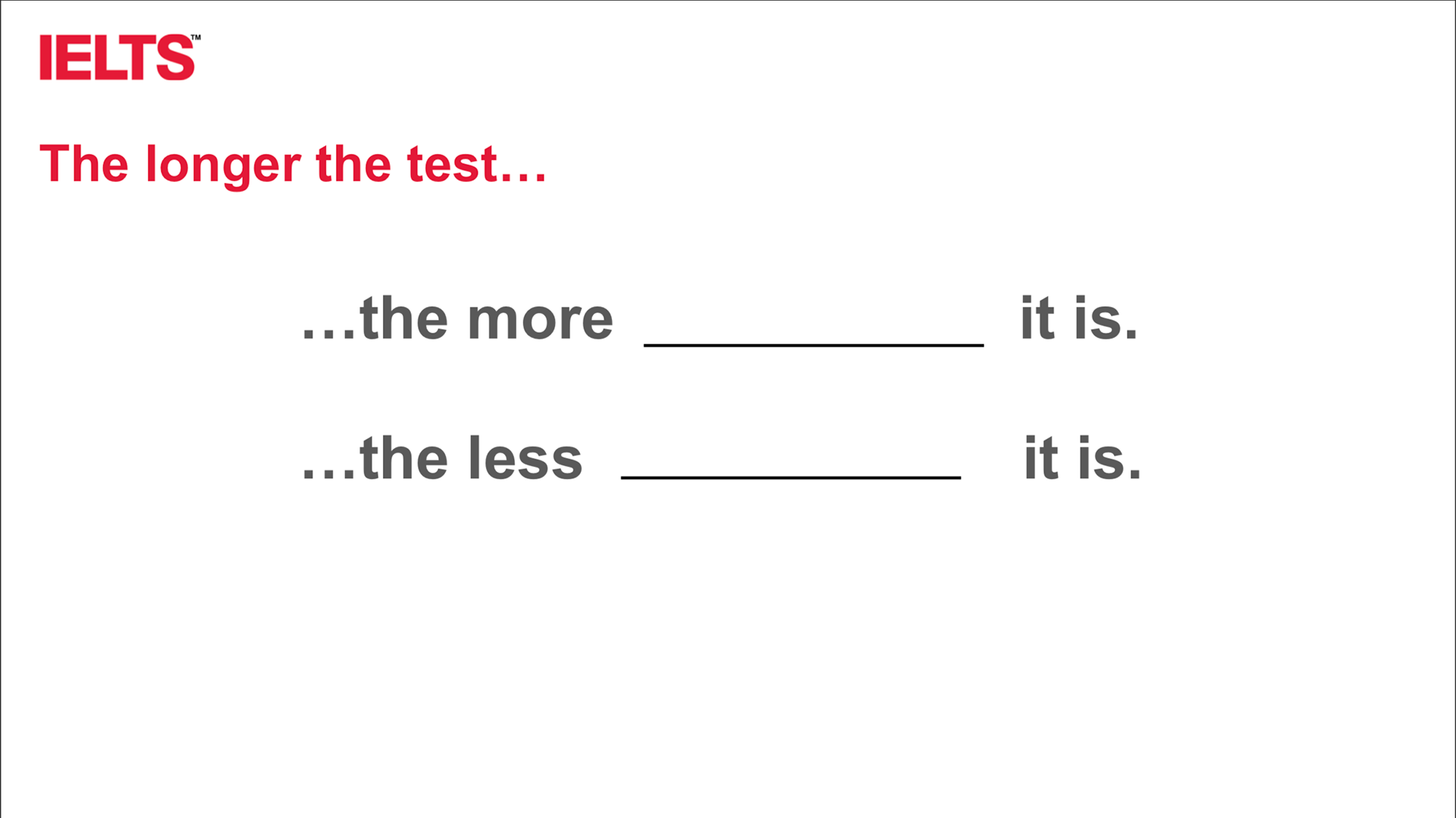
IELTS is a complex topic to undertake. The average new staffer is given a year to wrap their head around, begin to develop a command of the product, and gain authoritative voice. One of the major initiatives I undertook was to re-structure the design of the haphazardly assembled workshop-presentation, and refocus it around visual storytelling to accompany its presenters and robust data visuals.
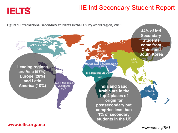
Before
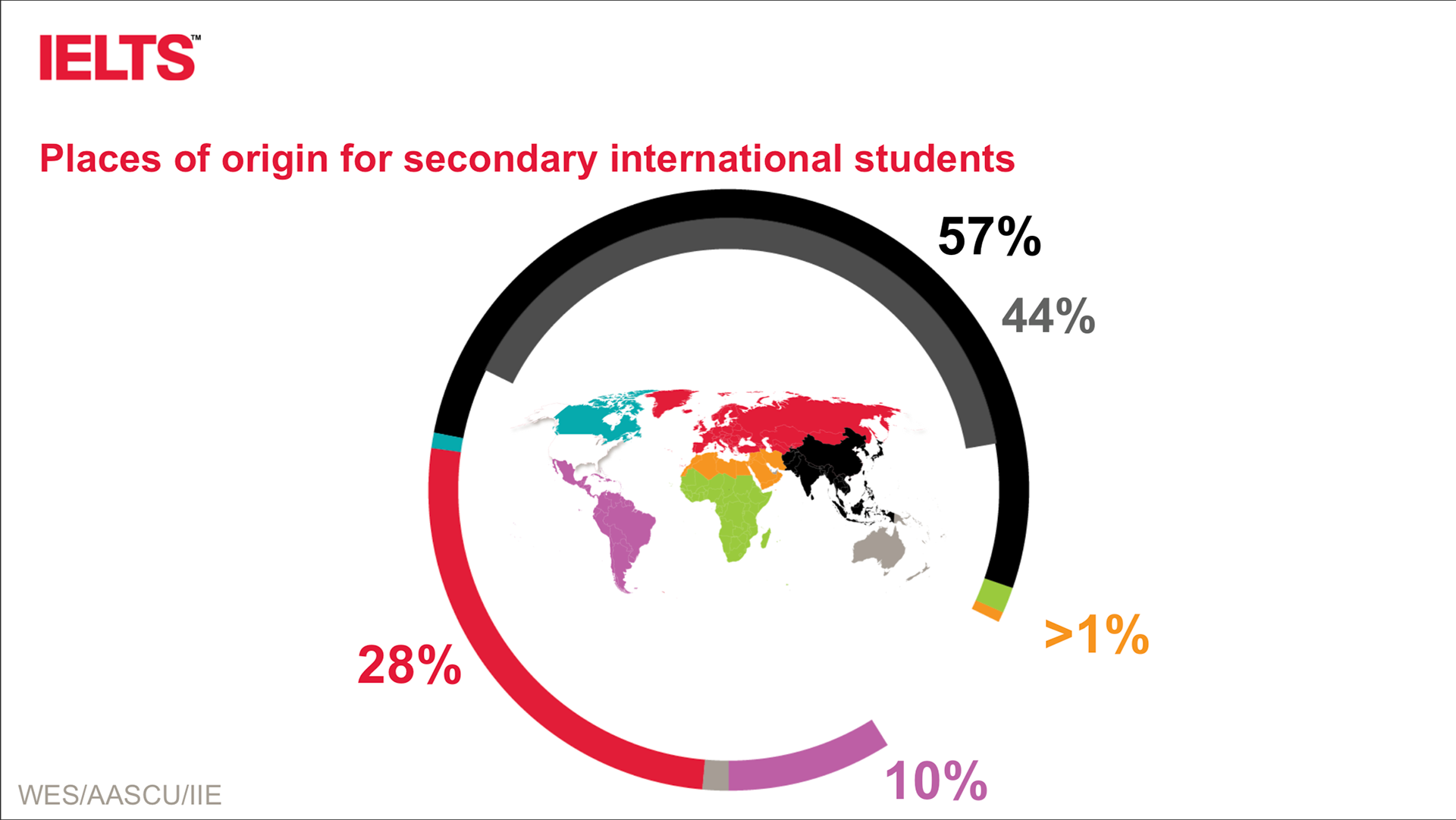
After
The result is a radical simplification of the text, separating complex ideas across several slides in the deck rather than trying to squeeze text-heavy slides that are read aloud.
I worked with the Recognition team to develop the narrative, and hone the story they would tell rather than read from the screen. Of course, the details were provided in the presentation notes for quick cribbage.
